Official Government Data Shows an alarming rapid rise in temperature over 140 years. NASA offers a graph of global temperature for each year from 1880 to the present which shows that we are in a runaway warming trend that constitutes a “climate emergency.” It’s a statistical sleight of hand. The widely cited NASA global temperature graph is highly magnified and visually misleading. But that hasn’t stopped corporate media from using NASA’s data to inform their readers of a “climate emergency.”
In an article, EverythingClimate (“EC”) demonstrated how, by manipulating how data appears on a chart, a “climate emergency” is manufactured. Although it’s not clear when the article was published, EC uses the example of a Guardian article from January 2020 which may indicate it was written in the same year.
Let’s not lose touch…Your Government and Big Tech are actively trying to censor the information reported by The Exposé to serve their own needs. Subscribe to our emails now to make sure you receive the latest uncensored news in your inbox…
Irrespective of the date it was written or published, EC’s article is as relevant then as it is today, especially in the context of “record” temperatures over the first couple of days this week in the UK. And at the very least, what this article proves is we should question everything corporate media is promoting. Corporate media have long lost their purpose of being sources of unbiased journalism and providing the public with the facts they need to know.
EC is a website covering both sides of the climate debate. It is devoted to cataloguing, evaluating and publishing information concerning scientific theories of global warming.
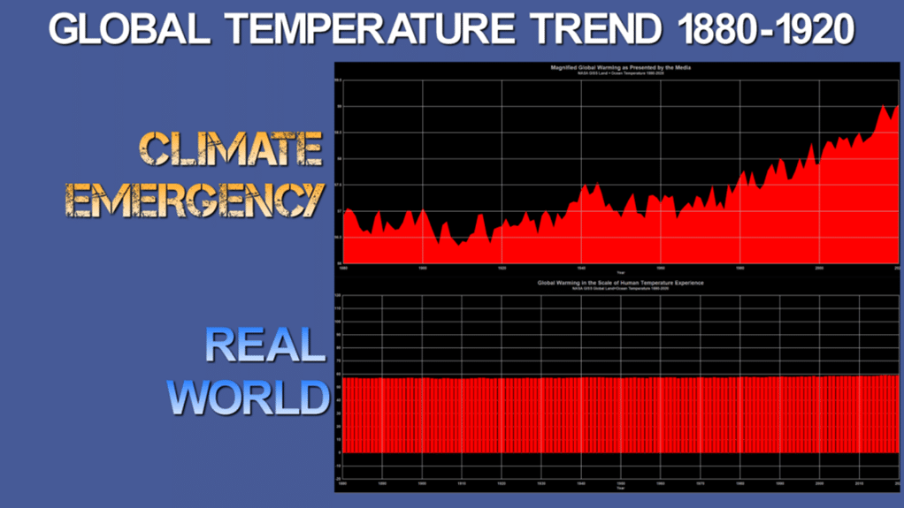
Republished from EverythingClimate
Pro: Official Government Data Shows an Alarming Rapid Rise in Temperature Over 140 years
NASA’s Goddard Institute for Space Studies (“GISS”) is the original organisation to raise the warning on global temperature increases, due to increasing carbon dioxide in Earth’s atmosphere, during an address to the US Senate by Dr. James Hansen in June 19881.
NASA GISS maintains a website where the data and graphs derived from that data are publicly available. They say:
The GISS Surface Temperature Analysis ver. 4 (GISTEMP v4) is an estimate of global surface temperature change. Graphs and tables are updated around the middle of every month using current data files from NOAA GHCN v4 (meteorological stations) and ERSST v5 (ocean areas), combined as described in our publications Hansen et al. (2010) and Lenssen et al. (2019). These updated files incorporate reports for the previous month and also late reports and corrections for earlier months.
They offer a graph of global temperature for each year from 1880 to the present as seen below.
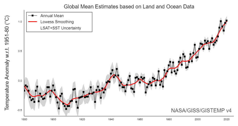
This particular graph (Figure 2) is the most cited and referenced graph of its kind in the world, depicting a sharp rise in global temperature over the 140 years from 1880 to 2020. It shows that we are in a runaway warming trend that constitutes a “climate emergency”.
Media outlets understand and have adopted the term “climate emergency” and use it more frequently in headlines. In a 2020 article, seen below, they use data from NASA GISS to inform their readers.
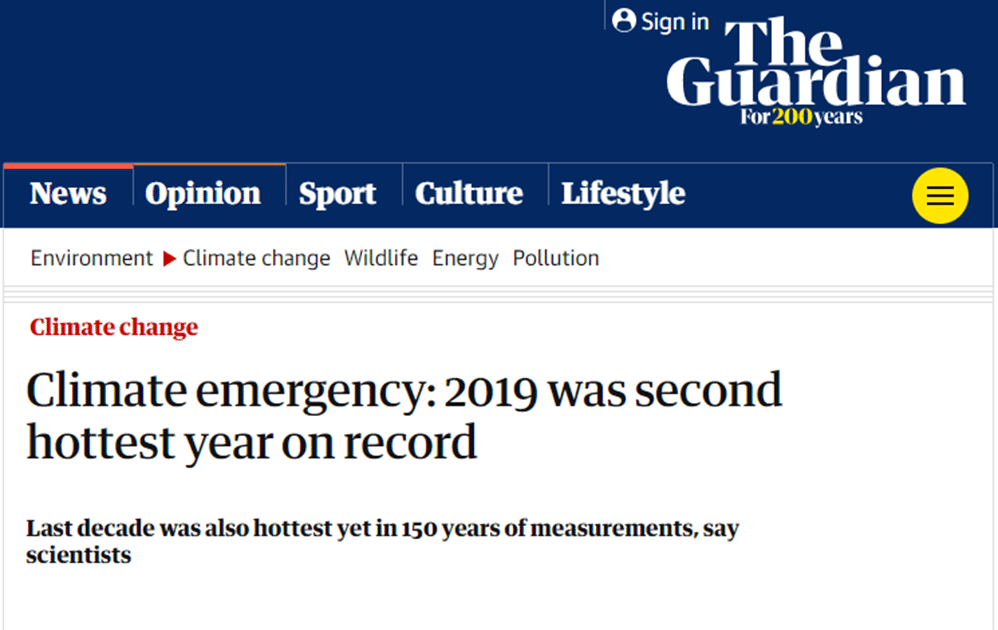
The average temperature in 2019 was about 1.1C above the average from 1850-1900, before large-scale fossil fuel burning began. The world’s scientists have warned that global heating beyond 1.5C will significantly worsen extreme weather and suffering for hundreds of millions of people.
Climate emergency: 2019 was second hottest year on record, The Guardian, 15 January 2020
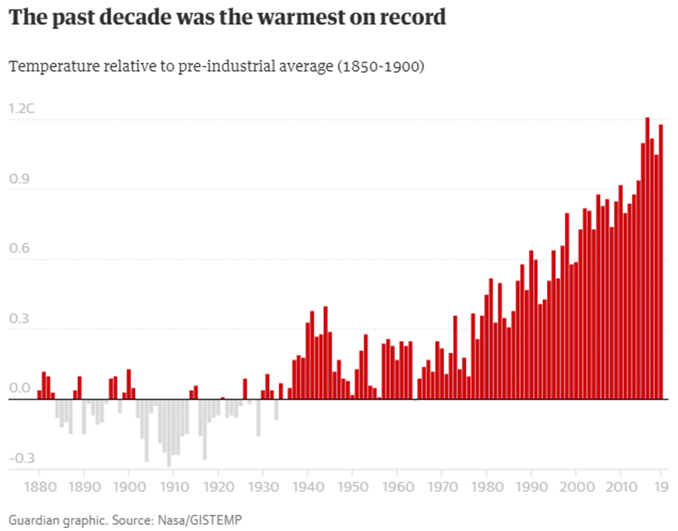
The term “climate emergency” has seen a surge in use ever since its awareness grew after being used by the media to describe what appears to be a rapid global temperature rise.
From Wikipedia:
Oxford Dictionary chose climate emergency as the word of the year 2019 and defines the term as “a situation in which urgent action is required to reduce or halt climate change and avoid potentially irreversible environmental damage resulting from it.” Usage of the term soared more than 10,000% between September 2018 and September 2019.
Climate emergency declaration, Wikipedia, last edited 20 July 2022
The steep slope of the graph makes clear that Earth’s temperature is rising so quickly that it constitutes an emergency requiring immediate action.
Con: The widely cited NASA global temperature graph is highly magnified and visually misleading
Note that the Guardian article cites:
“The average temperature in 2019 was about 1.1C above the average from 1850-1900, before large-scale fossil fuel burning began.”
The entire graph and temperature data set from NASA GISS is displaying just a small change of 1.1°C of temperature, which is highly magnified to show the trend. Because this small temperature change is magnified, it gives the false impression of having a steeply rising slope. For the unobservant, that steep slope looks like a dangerous trend that would constitute a “climate emergency”.
Note the two graphs below. Figure 4 shows how global warming is depicted in the media from NASA GISS data (such as seen above in the Guardian article), plotting a narrow temperature range to show a magnified graph.
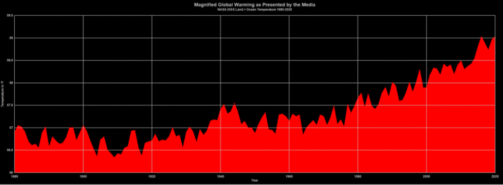
httpsdatagissnasagovgistempgraphs v4graph dataGlobal Mean Estimates based on Land and Ocean Datagraphtxt
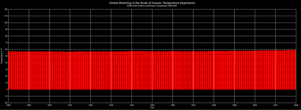
Figure 5 below shows the exact same data when plotted on the scale of human temperature experience, such as the range of temperature we experience yearly from winter to summer. This is done by removing the anomaly calculation from the GISS data, using the agreed-upon baseline temperature:
For the global mean, the most trusted models produce a value of roughly 14°C, i.e., 57.2°F
GISS Surface Temperature Analysis, NASA [Note: This page was updated on 18 March 2022. It would appear the quote above may have been amended to read “they often used a baseline of about 14°C (following Jones et al, 1999)”]
Simply using an Excel Spreadsheet allows us to add that 57.2°F temperature back to the NASA GISS anomaly data value. You can download and examine the spreadsheet here for yourself: GISSinabsolute2020.xlsx or Download
The result of that process gives you Figure 5:
httpsdatagissnasagovgistempgraphs v4graph dataGlobal Mean Estimates based on Land and Ocean Datagraphtxt
Data converted back to original absolute temperature values using Excel
Figure 5 shows a slow, and gradual temperature rise in actual absolute temperatures over the last 140 years. The difference with Figure 4 is striking and doesn’t look alarming at all.
If you were presented with Figure 5 as proof of an impending “climate emergency” would it be as concerning as Figure 4 or the NASA GISS graph commonly cited in the media?
In the article Lessons on How to Lie with Statistics by Will Koehrsen Jul 28, 2019, he makes the following point:
How to Lie with Statistics2 is a 65-year-old book that can be read in an hour and will teach you more practical information you can use every day than any book on “big data” or “deep learning.”
Always Look at the Axes on a Chart
Adjusting the axes of a graph to make a point is a classic technique in manipulating charts. As a first principle, the y-axis on a bar chart should always start at 0. If not, it’s easy to prove an argument by manipulating the range, by, for example, turning minor increases into massive changes:
Lessons on How to Lie with Statistics, Will Koehrsen, 28 July 2019
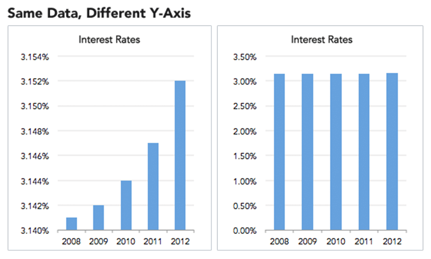
Just like in the GISS temperature graph that uses a non-zero starting point for the Y-axis, the first Figure 6 graph on the left suggests interest rates are rising dramatically. But, when plotted in the full context of the data, on the right, the rise in interest rates does not look concerning at all.
The same misleading process is on display with the NASA GISS temperature graph comparison in Figures 4 and 5.
Magnified and scary-looking temperature data aside, many scientists don’t believe we have a “climate emergency” at all even though high-schooler Greta Thunberg is impassioned enough to present her concerns to the United Nations3.
But some 500 scholars and scientists say there’s no “climate emergency” at all.
On the [same day] that Greta Thunberg made an impassioned speech to the United Nations about her fears of a climate emergency, a group of 500 prominent scientists and professionals, led by the CLINTEL co-founder Guus Berkhout, sent this registered letter to the United Nations Secretary-General stating that there is no climate emergency and climate policies should be designed to benefit the lives of people. Here’s the press release, and here’s the list of 500 signees.
There Is No Climate Emergency, Say 500 Experts in Letter to the United Nations, American Enterprise Institute (AEI), 1 October 2019
Clearly, the global temperature data does not support the idea of a “climate emergency”, because when you view it on the proper scale of normal human experience, the steep rise in temperature disappears. And clearly, 500 knowledgeable people of science say there’s no need to worry.
References:
- 1 Global Warming Has Begun, Expert Tells Senate. The New York Times, June 24th, 1988. https://www.nytimes.com/1988/06/24/us/global-warming-has-begun-expert-tells-senate.html
- 2 How to Lie with Statistics Darrell Huff, (1954) (illust. I. Geis), Norton, New York, ISBN 0-393-31072-8
- 3 Greta Thunberg tells world leaders ‘you are failing us’, as nations announce fresh climate action, United Nations Department of Economic and Social Affairs, 24 September 2019, https://www.un.org/development/desa/youth/news/2019/09/greta-thunberg/
The Expose Urgently Needs Your Help…
Can you please help to keep the lights on with The Expose’s honest, reliable, powerful and truthful journalism?
Your Government & Big Tech organisations
try to silence & shut down The Expose.
So we need your help to ensure
we can continue to bring you the
facts the mainstream refuses to.
The government does not fund us
to publish lies and propaganda on their
behalf like the Mainstream Media.
Instead, we rely solely on your support. So
please support us in our efforts to bring
you honest, reliable, investigative journalism
today. It’s secure, quick and easy.
Please choose your preferred method below to show your support.
Categories: Breaking News, World News

Carbon dioxide does not cause climate change but there could be another explanation of the recent record breaking temperature and drought here in SE England. Could it be deliberate geoengineering? See geoengineeringwatch.org
Paul Watson made an interesting observation in his video https://brandnewtube.com/watch/hottest-day-ever-really_ZoQmudq7KmJAAln.html .
He says the latest temperature records in the UK were taken at airports, where they have hot tarmacs.
He interestingly starts off the video by saying, “Well…I guess the climate change alarmists were actually correct…I was wrong…lefties were vindicated”, before mentioning the thing about the airport tarmacs.
It was funny because when the UK heat record was announced, I was thinking the same thing he said about climate change alarmists being correct, except for real – not sarcastically!
The fires am sure are not accidental –
Die Sonne bestimmt unser Klima, – und auf die haben wir welchen Einfluss?
Richtig: keinen.
Also, a significant percentage of temperature measurements are made near airport runways and in cities, so data is skewed anyways…
If the global climate is bizarre it’s due to NATO geo engineering – the private army of the khazarian mafia – the ‘elite’, the thugs doing all in their power to outsmart God and Nature; THAT is climate change; 5g emf + chemtrails; plus all the other goods they inflict that we have only an inkling about; the flooding in Sydney, all geared from the local power statons; 5g is the weapon for their climate engineering ultimately; depower the masts and things might be quite different indeed – in so so many respects
The hottest decade in the last 100 years was the 1930s. The temperatures for the last 20 years have barely risen if at all. Many climatologists think that we may be approaching a period of falling temperatures.
Maunder Minimum. About 2017, UK and Russian scientists said that by the early to mid 2020s, UK winters will be so cold, the Thames will freeze over to the extent people could skate on it. NASA agreed with this report.
Well, my 4th of July in Vermont (normally hottest month of the year) was spent shivering in bed with temps in the low 40’s (F). It wasn’t the first time this happened in recent years. So, I’m still waiting for the warming alarm to go off over here. Records are made to be broken. Every day, somewhere in the world, a record will be broken, either high or low, or wet or dry. Its just the nature of record keeping. And whoever said that weather should always stay the same ? That would seem more unreasonable to me.
Data shows that the planet is actually getting colder and has been doing so for a while, meteorologists using weather satellites showed this and were told by the government to stop spreading misinformation or be defunded. There is also the fact that the solar system is currently in a sunspot minimum and is like this until 2030. This cycle of 11 years is different as the sun will not get back to normal in 2030 but will then start another 22 year full cycle up to 2052 and this is called a Maunder minimum. This will result in a mini ice age and not global warming. The warming is being caused partly by the planet’s orbit of the sun which is not circular as the earth is slowly tilting and we are getting closer to the sun in our orbit. This creates a lot of vapor from the sea and this water vapor is what is deflecting the heat back to the planet, ie, it’s not man-made ozone from carbon monoxide. The dates of the solar cycles are interesting as they are the same dates used by the governments pushing for carbon neutral etc. In a nutshell, there is no manmade global warming, it’s a natural phenomenon that has happened many times through the centuries and at times when people lived in caves, didn’t have gas or electricity and no fuel-guzzling vehicles.
“The dates of the solar cycles are interesting as they are the same dates used by the governments pushing for carbon neutral etc.”
I wonder if you could tell us more about that.