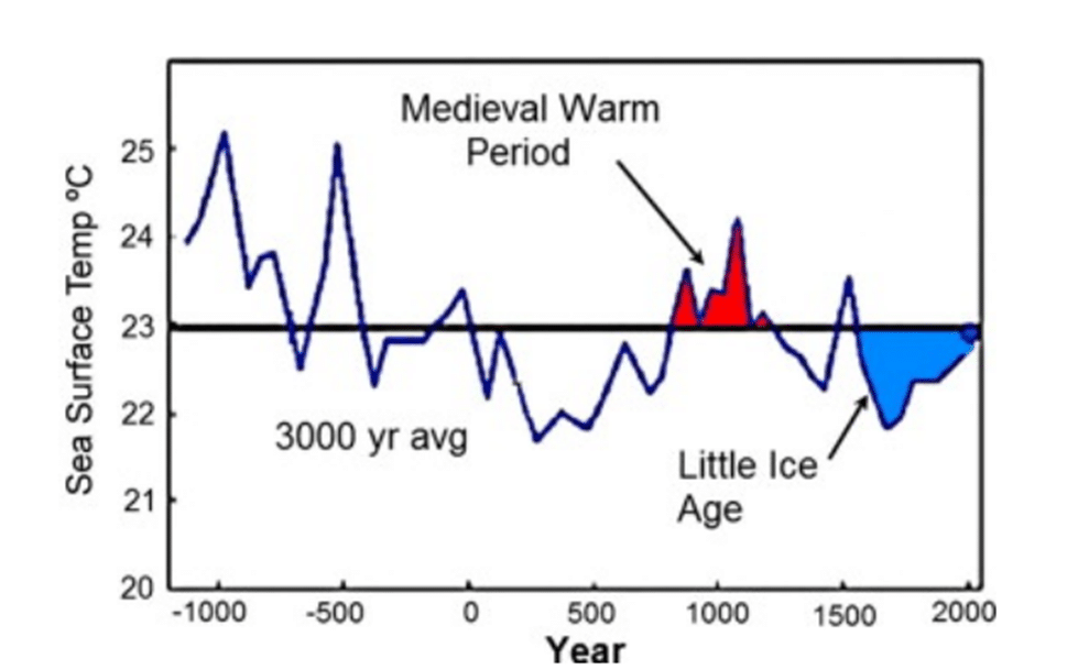
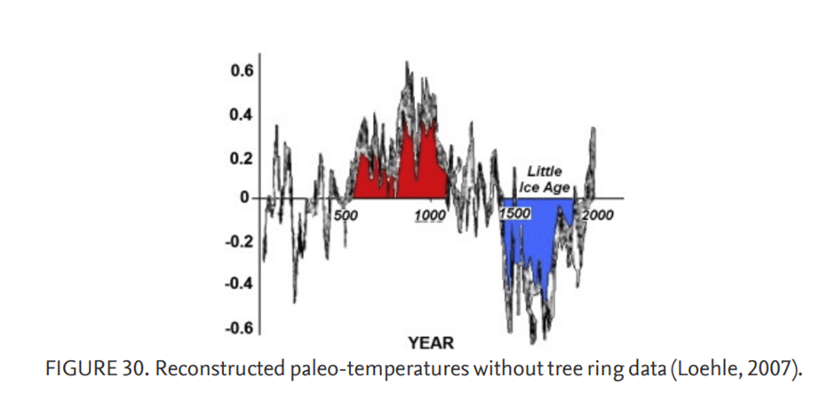
Over many decades, several thousand papers were published establishing the Medieval Warm Period from about 900 AD to 1300 AD and the Little Ice Age from about 1300 AD to 1915 AD as global climate changes.
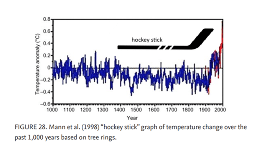
It came as quite a surprise when, in 1998, Mann et al. concluded that neither the Medieval Warming Period nor the Little Ice Age happened. The fudged temperature graph became known as the “hockey stick graph,” but it should be referred to as the “hockey stick trick.”
The graph was prominently featured in the 2001 Intergovernmental Panel on Climate Change’s Third Assessment Report and is used to this day to incite fear of man-made climate change.
Related: Climategate is the worst scientific scandal of our generation and other “Climategate” articles on The Exposé
Let’s not lose touch…Your Government and Big Tech are actively trying to censor the information reported by The Exposé to serve their own needs. Subscribe to our emails now to make sure you receive the latest uncensored news in your inbox…
Randall Carlson is an architect and architectural designer who has appeared on podcasts where he discusses climate change and geological events. He argues that the Earth naturally goes through climate cycles, that current mass extinctions may not be unprecedented and that human influence on climate change is overstated for political reasons.
“The impact that we are having on the environment … is quite minimal … they’re using the impact of humans on the climate as, now, a political issue more than it is a scientific issue,” he said on the Koncrete podcast in 2021.
You can watch the full podcast HERE. Below is a clip taken from it.
Carbon dioxide (CO2) is necessary for photosynthesis. Below 180 parts per million (“ppm”), there is too little carbon dioxide in the atmosphere for plants to survive. The first plants that will die off are “the stuff we eat,” Carlson said. Currently, atmospheric CO2 is 406 ppm. “If we look at the last 10 or 12,000 years, our baseline is now the lowest carbon dioxide has been in 600 million years,” Carlson said.
He then explained that, to exaggerate global warming, scientists removed data to create the “hockey stick” temperature graph.
In the first UN Intergovernmental Panel on Climate Change (“IPCC”) report published in 1992, it was admitted that temperature change was far higher in the Medieval Warming Period:
A recent study of documentary evidence in China (Wang and Wang, 1991; Wang et al, 1991) … [finds] good evidence in this region for a “Medieval Climatic Optimum” (S7, p 202) around 870-1110, another warm period around 1360 1570, and a “Littie Ice Age” (S7, p202) period around 1570-1750.
Climate Change 1992: The Supplementary Report to the IPCC Scientific Assessment
The Medieval Warm Period, also known as the Medieval Climate Anomaly or Medieval Climate Optimum, refers to a phase of warmer climate conditions that occurred roughly between 950 and 1300 AD, primarily in the North Atlantic region and much of northern and western Europe. It was characterised by warmer and drier conditions globally, with temperatures reaching levels of about 1-2oC warmer than they are now.


Because the Medieval Warming Period didn’t fit their narrative, they erased the Medieval Warming Period, Carlson said. “By the time the 1996 [IPCC] report came out, the whole graph of climate change temperature change from a thousand years ago to now was basically flattened … They got rid of the Medieval Warming Period and the Little Ice Age and … they flattened [the graph] out.”
“Then they added instrumental record on the end that looks like it’s going way up because it is not accounting for the urban heat island effect,” he added. “It was a completely contrived graph called the ‘hockey stick’. This is the [graph] that has been utilised since the mid-1990s to incite this fear [about climate change].”


The Expose Urgently Needs Your Help…
Can you please help to keep the lights on with The Expose’s honest, reliable, powerful and truthful journalism?
Your Government & Big Tech organisations
try to silence & shut down The Expose.
So we need your help to ensure
we can continue to bring you the
facts the mainstream refuses to.
The government does not fund us
to publish lies and propaganda on their
behalf like the Mainstream Media.
Instead, we rely solely on your support. So
please support us in our efforts to bring
you honest, reliable, investigative journalism
today. It’s secure, quick and easy.
Please choose your preferred method below to show your support.
Categories: Breaking News, World News

So I guess I was right all along. It really is ll about “ you will own nothing and be happy”. Remember just because Schwab stepped down due to his sticky fingers those roaches aren’t done yet.
So basically the final graph with the ‘hockey stick’ logo is a stretched out version of the previous graph but commencing from year 1000 thus removing data from year 0 to year 1000. The first graph includes data for an even longer period as it starts at 1000BCE up to present day, that is three thousand years. The hockey stick shape should be considered unsurprising based on evidence of previous climate temperatures at the longer timescale, and thus not alarming. The question is what is the data and its source that the three graphs are analysing, and why were different timescales used.
From WIKI:
The Holocene Climate Optimum was a warm period in the first half of the Holocene epoch, that occurred in the interval roughly 9,500 to 5,500 years BP, with a thermal maximum around 8000 years BP.
It has also been known by many other names, such as Altithermal, Climatic Optimum, Holocene Megathermal, Holocene Optimum, Holocene Thermal Maximum, Holocene global thermal maximum, Hypsithermal, and Mid-Holocene Warm Period.
The warm period was followed by a gradual decline, of about 0.1 to 0.3 °C per millennium The Holocene Climate Optimum was a warm period in the first half of the Holocene epoch, that occurred in the interval roughly 9,500 to 5,500 years BP, with a thermal maximum around 8000 years BP.
It has also been known by many other names, such as Altithermal, Climatic Optimum, Holocene Megathermal, Holocene Optimum, Holocene Thermal Maximum, Holocene global thermal maximum, Hypsithermal, and Mid-Holocene Warm Period. The warm period was followed by a gradual decline, of about 0.1 to 0.3 °C per millennium.
____________________
After that Holocene Climate Optimum, were warm periods ( stone age, Roman warm period, etc.). Common to all these periods was that they all were cooler than previous warm period.
This “man made global warming” is cooler than medieval warm period.
We are going to next ice age.
“Deserts ‘greening’ from rising CO2” – Australia’s science agency CSIRO
https://www.csiro.au/en/news/All/News/2013/July/Deserts-greening-from-rising-CO2
The global warming lie, the “CO2 is bad” lie, is used as the excuse for their plan to reduce the amount of sunlight reaching the Earth’s surface, i.e. dimming the sun.
At one minute, forty seven seconds in, Dr Campbell makes a good point about photosynthesis –
“Sun dimming experiments”
https://www.youtube.com/watch?v=h4vxsLwEMhM
AI-Led Study Confirms ‘Climate Change’ Narrative Is a Hoax
Frank Bergman March 25, 2025
https://slaynews.com/news/ai-led-study-confirms-climate-change-narrative-hoax/
Most experts agree that 1,500 ppm is the maximum CO2 level for maximum plant growth, although any CO2 level between 1,000 ppm and 1,500 ppm will produce greatly improved results. Greenhouse CO2 levels are jacked up to enhance plant growth.
co2.earth/co2-ice-core-data
The average CO2 ppm level the last thousand up till 1841 years averaged approximately 280 ppm. Since 1841 CO2 levels have increased to 422 ppm in Jan. 2024. That helps plant growth.
Anything below 200 ppm starves plant growth! Carbon dioxide is essential to the process of photosynthesis. Most plants grown indoors require a minimum CO2 concentration of 330 ppm to enable them to photosynthesise efficiently and produce energy in the form of carbohydrates. These concentrations of CO2 are enough for plants to grow and develop normally.
Millions of years ago CO2 ppm levels and temperature was much higher. Plants trived! Concentrations of CO 2 in the atmosphere were as high as 4,000 ppm during the Cambrian period about 500 million years ago, and as low as 180 ppm during the Quaternary glaciation of the last two million years.
Ice core data does not lie! Look it up! I just did.
……………….
Greta Thunberg, Al Gore and Bill Gates are lying leftist frauds!
Industrial CO2 emissions since 1841 likely staved off an Ice Age!
Challenging Modern Climate Narratives: Forgotten 1937 Aerial Photos Expose Antarctic Anomaly
By UNIVERSITY OF COPENHAGEN – FACULTY OF SCIENCE JUNE 11, 2024
https://scitechdaily.com/challenging-modern-climate-narratives-forgotten-1937-aerial-photos-expose-antarctic-anomaly/
Researchers at the University of Copenhagen have utilized aerial photos from 1937 to analyze the stability and growth of East Antarctica’s ice, revealing that despite some signs of weakening, the ice has remained largely stable over almost a century, enhancing predictions of sea-level rise. Credit: Norwegian Polar Institute in Tromsø
More About the Study