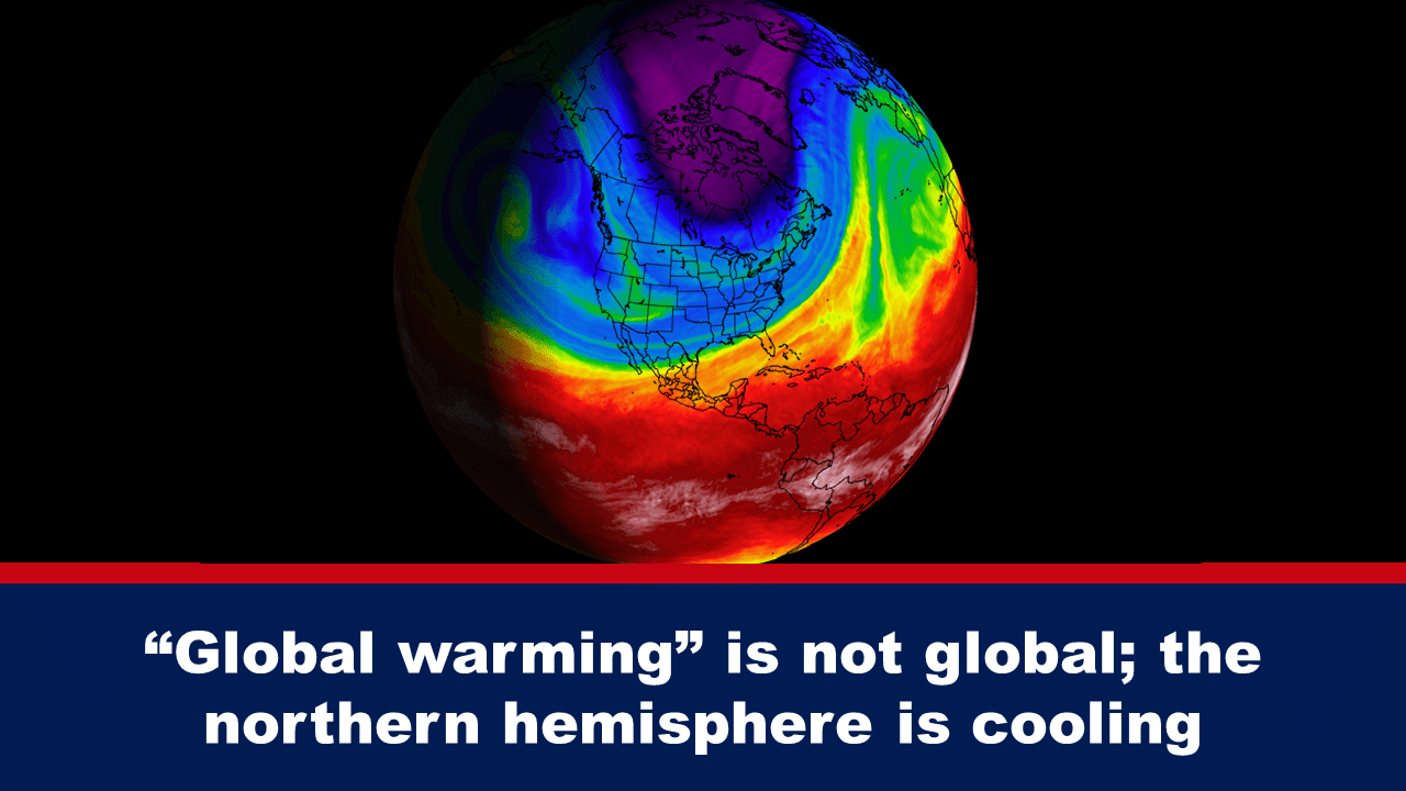
When climate alarmists market their “catastrophic anthropogenic climate change” agenda, it is, to a large degree, on the presumption that the Western World is causing “global warming.” The largest countries of the West are located in the northern hemisphere. A Twitter user has pointed out an anomaly in monthly temperature changes demonstrating “global warming” is not global nor is the northern hemisphere, and therefore the West, experiencing “warming.”
Let’s not lose touch…Your Government and Big Tech are actively trying to censor the information reported by The Exposé to serve their own needs. Subscribe to our emails now to make sure you receive the latest uncensored news in your inbox…
It is claimed that a major component of anthropogenic climate change is global warming, which refers to a gradual warming of the earth caused by a human-induced increase of the greenhouse effect, as concentrations of greenhouse gases increase primarily from the burning of fossil fuels such as coal, oil, and natural gas.
Repeatedly the West – generally considered to comprise of USA, Canada, European countries, Australia, and New Zealand – has been blamed for the increase of the “greenhouse effect.”
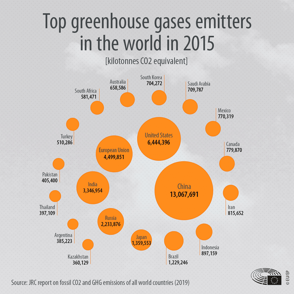
The “greenhouse gas footprint,” or “carbon footprint,” is how climate alarmists measure “gaseous emissions that are relevant to climate change and associated with human production or consumption activities.” According to their calculations, the US is the second largest greenhouse gas emitter in the world after China. But China’s emissions are America’s and Europe’s fault according to a 2009 report by The Guardian. “The full extent of the West’s responsibility for Chinese emissions of greenhouse gases has been revealed by a new study,” The Guardian wrote.
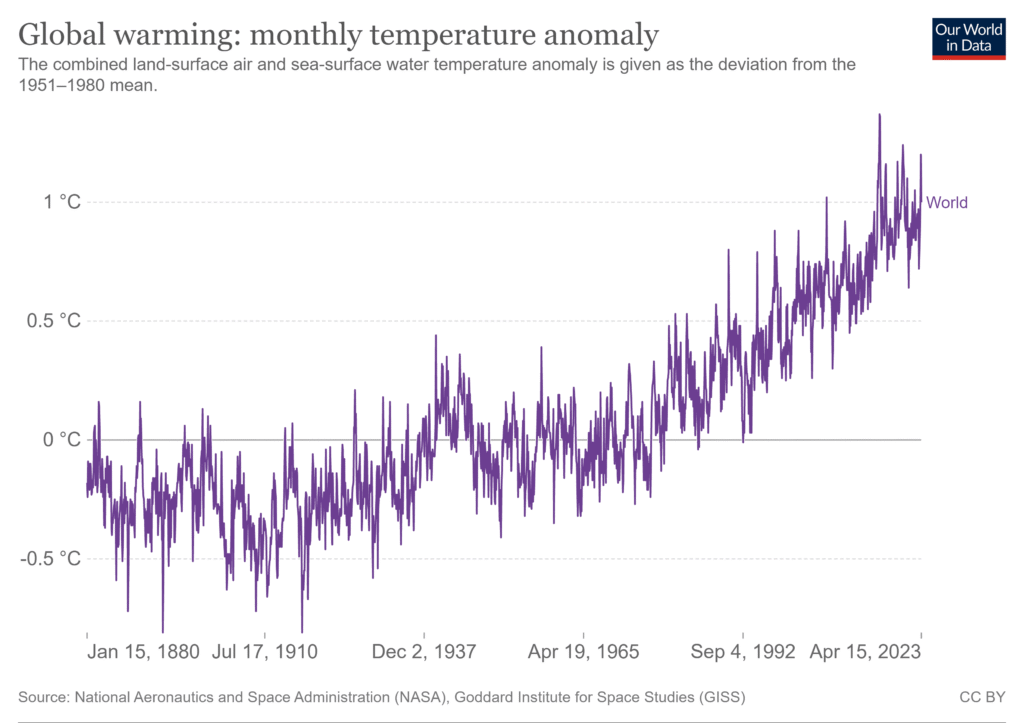
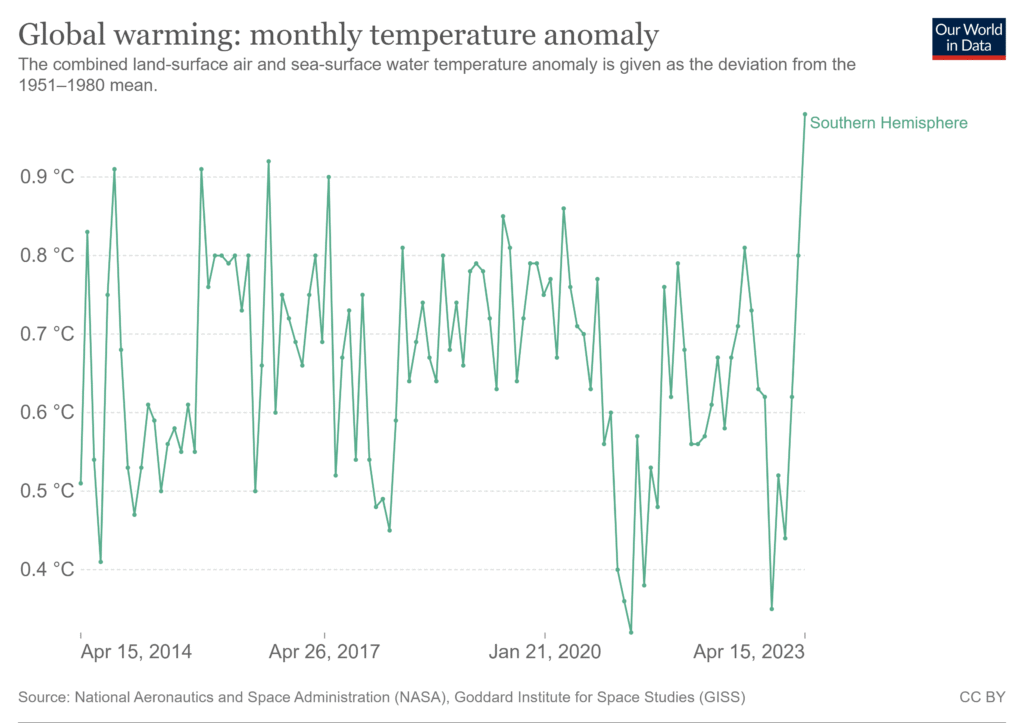
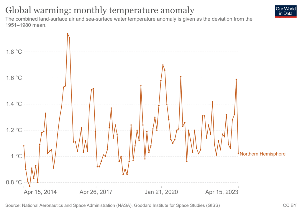
Zacki tweeted two comparable graphs from Oxford University’s Our World in Data (“OWD”) which shows the temperature change from month to month for the last ten years. One graph was for the northern hemisphere and the other for the southern hemisphere. The graphs represent data for the combined land-surface air and sea-surface water temperature change given as the deviation from the 1951–1980 mean. The data has been obtained from the National Aeronautics and Space Administration (“NASA”), Goddard Institute for Space Studies (“GISS”).
NASA has also used this data to create monthly temperature anomaly maps to show how much warmer or colder a region may be in a given month compared to the norm for that same month in the same region from 1951-1980. It’s important to reiterate that these maps do not depict absolute temperature but instead show temperature anomalies, or how much it has changed.
For a few years, NASA has been publishing animated figures, or videos, from the GISS data set that show the seasonal cycle in global temperature anomalies for every month since 1880 – showing how much the global monthly temperature was above or below the annual global mean from 1980–2015. Below is the latest colour-coded video published by NASA. Normal temperatures are shown in white. Higher-than-normal temperatures are shown in red and lower-than-normal temperatures are shown in blue. Normal temperatures are calculated over the 30-year baseline period 1951-1980.
In 2020, two of America’s most respected and prolific atmospheric physicists, MIT professor emeritus Richard Lindzen and University of Alabama in Huntsville professor John Christy wrote a paper to explain how the NASA/GISS data set – referred to by policy-makers and the media as the global surface temperature record – is actually obtained and where it fits into the popular narrative associated with climate alarm. One of the aspects of NASA’s record the paper addressed is the implications of the way the record is constructed and presented, and why it is misleading.
“In order to obscure the fact that the global means are small residues of large numbers whose precision is questionable, the common presentations plot the global mean anomalies without the scattered points and expand the scale so as to make the changes look large,” the paper noted (page 9). This is precisely what OWD has done. If you open OWD’s page for ‘Global warming: monthly temperature anomaly’ you will see that the default graph, without scatter points, begins in 1880.
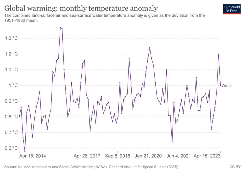
Despite their trickery, the global climate change narrative begins to fall apart using their own graphical representations. In the slide view below are three graphs taken from OWD but with a reduced time frame to only show data from the last ten years, from 15 April 2014 to 15 April 2023. The first shows the global monthly change in temperatures, the second is filtered for the southern hemisphere only and the third for the northern hemisphere.
What these graphs appear to show is that the northern hemisphere is cooling while the southern hemisphere is warming. In other words, the hemisphere where the largest Western nations that are committing “emissions crimes” are located is cooling.
That the northern hemisphere is cooling is supported by the latest scientific studies which show Europe’s temperature will drop slightly over the next 15-20 years. This change in Europe’s climate is due to a weakening of the North Atlantic Oscillation and a cooling of the North Atlantic. It has nothing to do with covid shutdowns “reducing emissions” or any other human interventions/causes climate alarmists may claim. The cooling of Europe, climate alarmists say, will put global warming on pause.
Considering their data shows shows inconsistent temperature trends across hemispheres, perhaps NASA and OWD will need to have interactive titles on their images and graphs that switch from “global warming” to “global cooling” depending on where in the world the data relates. This is, of course, one of the advantages of using neither of those terms and, instead, using the catch-all phrase “climate change.”
Featured image: Weather 2022 | New anomalies are growing in the Atmosphere and the Oceans, that will change the weather patterns as we head deeper into the year
The Expose Urgently Needs Your Help…
Can you please help to keep the lights on with The Expose’s honest, reliable, powerful and truthful journalism?
Your Government & Big Tech organisations
try to silence & shut down The Expose.
So we need your help to ensure
we can continue to bring you the
facts the mainstream refuses to.
The government does not fund us
to publish lies and propaganda on their
behalf like the Mainstream Media.
Instead, we rely solely on your support. So
please support us in our efforts to bring
you honest, reliable, investigative journalism
today. It’s secure, quick and easy.
Please choose your preferred method below to show your support.
Categories: Breaking News, World News

CO2 has no capability of warming our climate.
There is no greenhouse effect, its a blanket at best and any effects of CO2 is a log scale diminishing effect, and most is seen in the first 100ppm.
Universities and Professors write that over 350ppm no measurable heating was found. As we are over 400ppm currently how can CO2 cause any climate emergency?
Climate changes, and it always has. What ever happens, happens and not because of any carbon footprint that is deception. Never listen to liars on any argument, its what they do in a Hegelian managed crisis.
You are absolutely correct! It’s possible that CO2 could cause microscopic cooling, depending on the convection rate. All heat leaves the earth by radiation and CO2 radiates as much as it adsorbs, half into space and half back to the surface. The basic premise of AGW theory is flawed. It’s energy not temperature that needs to be measured. The average temperature can be going up as the earth cools, and going down as the earth heats up. The science was corrupted by excluding critics and turned the AGW theory into pure bunk. It’s anti science, worse than nonsense and has led to solutions that cause more damage than good, if AGW was a problem.
Climate Change, aka AGW, aka Global Warming, is the largest, most elaborate and damaging scam ever perpetuated. The corrupt people behind it use tools of propaganda and mass marketing perfected by social scientist, in conjunction with a vast censorship effort to block information of every form. Newspapers, TV shows, newscasts, Internet social groups, blogs, forums, email, search engines and even name servers, have been corrupted to suppress critics and scientists with other views. What they’ve done in the name of ‘saving the environment’ has damaged it, taken resources away from real environmental problems, and undermined the economic system necessary for anything to be done about anything. Ignorance by the self righteous begets evil.
I may be stupid but that graph showing northern hemisphere is totally in the positive C, surely that means it show’s warming not cooling.
you can argue the warming is getting less but it’s still higher in the right than the left.